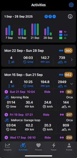
In the Activities screen you can review the current four weeks of activities. Each week block in the lower part of the screen can be expanded by clicking on the week summary.
Once you expand a week, all its activities are displayed; each with the activity name, the date, the distance, the duration and elevation gained. These individual values are accumulated into the week’s totals.
Clicking any activity will open a new details screen providing more information and graphs of the activity. In order to explain this more clearly, we will use data from a 60 minute training session.
Session Summary
The top of the activity details modal screen shows key metrics like the activity name, activity type, date, etc.
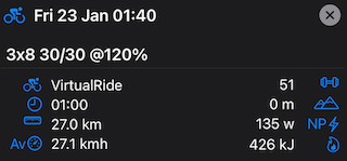
You can see that this training session on a turbo trainer generated a training load of 51 (points) and burned an estimated 426 KJ of energy over the hour.
Session Graphs
The session consisted of 3 sets of 8 one minute blocks comprising 30 seconds “on” at 230 watts followed by 30 seconds “off” at 105 watts after the initial warm up.
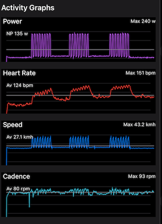
Each graph includes an average and the maximum values for each metric. The gray horizontal line denotes the average value.
There are a few things to note in these example graphs. Firstly the consistent nature of the power and speed charts indicate that this session was performed on a smart trainer using ERG mode which forces the rider to maintain the required power indicated by the training plan.
The second thing to note is the heart rate drift as the session progresses. During each 8 minute block the heart rate rises as expected but does not recover to the same level between the first and second and then the second and third blocks of efforts. Heart rate drift is an important metric for gauging the intensity of the session and your overall fitness. Generally the fitter you are the less drift you would expect to see although this depends heavily on the nature and intensity of the session.
Zone Distribution
The Profile screen of the RiderPulse app allows you to set your current maximum and resting heart rates along with your current FTP (sustained power over one hour). The app will use these values to determine your different heart rate and power zones and the duration spent in each for the session.
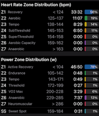
If we consider the power table first, we can see that 3/4 of the session was spent at or below 104 watts or zone 1 for this rider. We can also see that the remainder of the session (approximately 12 minutes) was spent at the border between zones 5 and 6. This is consistent with the session’s plan where the rider was expected to maintain 30s of 230w during the interval peaks.
If we look at heart rate we see a different picture which around 50% of the session (around 33 minutes) was spent in zone 1 with the remainder of the session (around 27 minutes) spent in zones 2,3 and 4. Each surge to 230 watts triggered a rise in heart rate while the 30 second recovery allowed the heart rate to fall again before the next 30 second peak. Because heart rate takes time to rise and then to recover, it is quite normal to see a spread of duration in zones 2-4 as confirmed in the heart rate graph (above).
Maximum Power
The maximum power graph indicates the maximum power generated for different durations during a ride or session where the key intervals (durations) are typically 1, 5, 30 seconds and 1, 20 minutes and 1 hour power values. Power is shown both in watts and watts per kg using your weight from the Profile screen - keeping your weight accurate is important if you prefer to analyse pwer in w/kg.
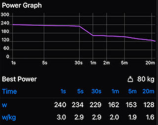
While it is normal to see a maximum power graph follow an exponential decay (sloping downwards from left to right). The maximum power graph for this session clearly shows a consistent 230 watt peak power for 30 seconds during each interval which is why the 1s, 5s and 30s power values are almost identical. This type of graph is a feature of using a smart trainer in ERG mode.
Maximum power is a useful metric for gauging the intensity of a session in different zones. A high 1-30s maximum power value indicates hard efforts from hills or sprints. A high 30s to 5 or 20 minutes indicates hard efforts most likely during a climb while power values from 20 minutes to 1 hour or more are indicative of your base power. You can train your top end, middle and base using specific drills and sessions and over time see their impact in the (maximum) Power screen which will accumulate these numbers over a 1, 4 and 12 week period for you.
Conclusion
RiderPulse provides a detailed analysis of your ride or training data from Strava, and presents it in such a way that makes it easier to understand and compare the different metrics against each other.
If for example, you intended to do a two hour zone 2 (base training) session then you would expect to see both the heart rate and power zone distribution mainly focused in zone 2. If however you see your heart rate in higher zones then either you pushed too hard or your fitness might be compromised.
If you see a mismatch between the power and heart rate zone distributions then this could be the result of poor fitness, illness or overtraining. Or it could just be the case that your current FTP is actually (quite) different from what you have recorded in the Profile screen and you could possibly benefit from retesting your FTP if you have not done it in a while.